Karger Image Explorer: From Qualitative Insight to Data-Validated Discovery
- Moderated usability testing
- Affordance testing
- GA4 analytics
The Context
Karger Image Explorer (KIE) is a platform giving access to over 250,000 peer-reviewed scientific images. One of its core functions is enabling users to request permission to reuse images found in published scientific content, a journey that depends entirely on how discoverable and frictionless that path is.
The product team had a hunch the permissions journey was broken. My job was to find out exactly where, why, and what to do about it.
Round One: Finding the Right Users
I recruited 5 external participants through User Interview: researchers, professors, and medical writers aged 28–50 from the US and Canada, all of whom regularly used peer-reviewed scientific images in their professional work and had no prior familiarity with Karger.
Sessions were conducted remotely and lasted 45 minutes each, combining affordance testing (could users find key elements at all?) with usability testing (could they complete tasks effectively?). I defined three core tasks: search for an image, filter results by open access, and request an image permission.
The sessions quickly surfaced an unexpected finding: we were talking to the wrong users. Academic researchers had no real need to license images, when they use a figure from a published paper, they simply cite the source. Permission fees weren't part of their workflow.
Rather than treating this as a failed round of research, I used it as a signal to investigate further. I spoke with an account manager who confirmed that image licensing fees typically apply when images are used for promotional purposes, pharmaceutical companies using clinical figures in marketing materials being the primary use case.
This reframed the entire research direction. I ran a second round of 5 remote sessions with professionals working in pharma.
Round Two: The Right Users, The Real Problem
I opened each session with a contextual warm-up rather than jumping straight into tasks: I asked participants to walk me through the last time they needed to use a medical image for promotional content. 4 out of 5 participants confirmed that navigating image rights and permissions was a genuine, recurring part of their workflow. This gave me confidence we were now talking to the right people.
I then asked participants to use the platform to find an image and request permission to use it. The result was consistent across all five sessions: nobody found the permissions button easily. It appeared in two locations, and neither worked.
- The first was buried inside a "Tools" icon requiring two extra clicks to reach.
- The second was on the search results page, where only one participant found it without help.
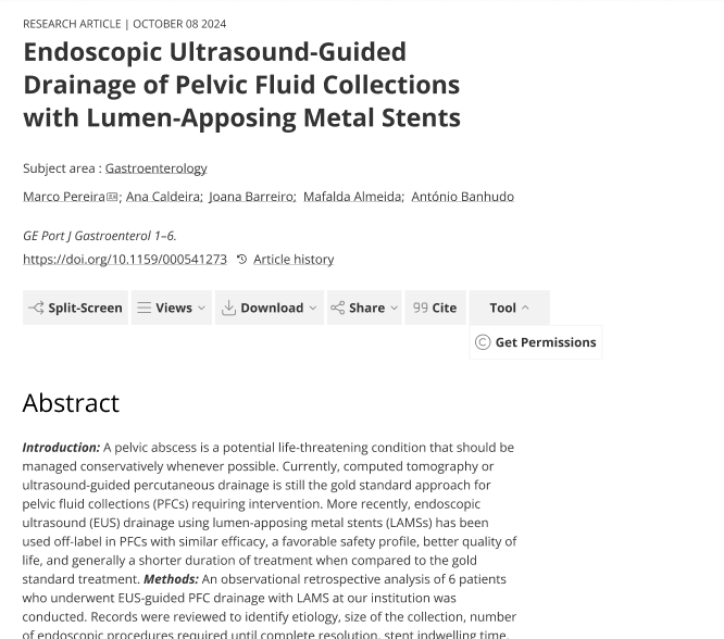

Users weren't discovering the platform's key features. Not because the interface was complex, but because the things that mattered were invisible.
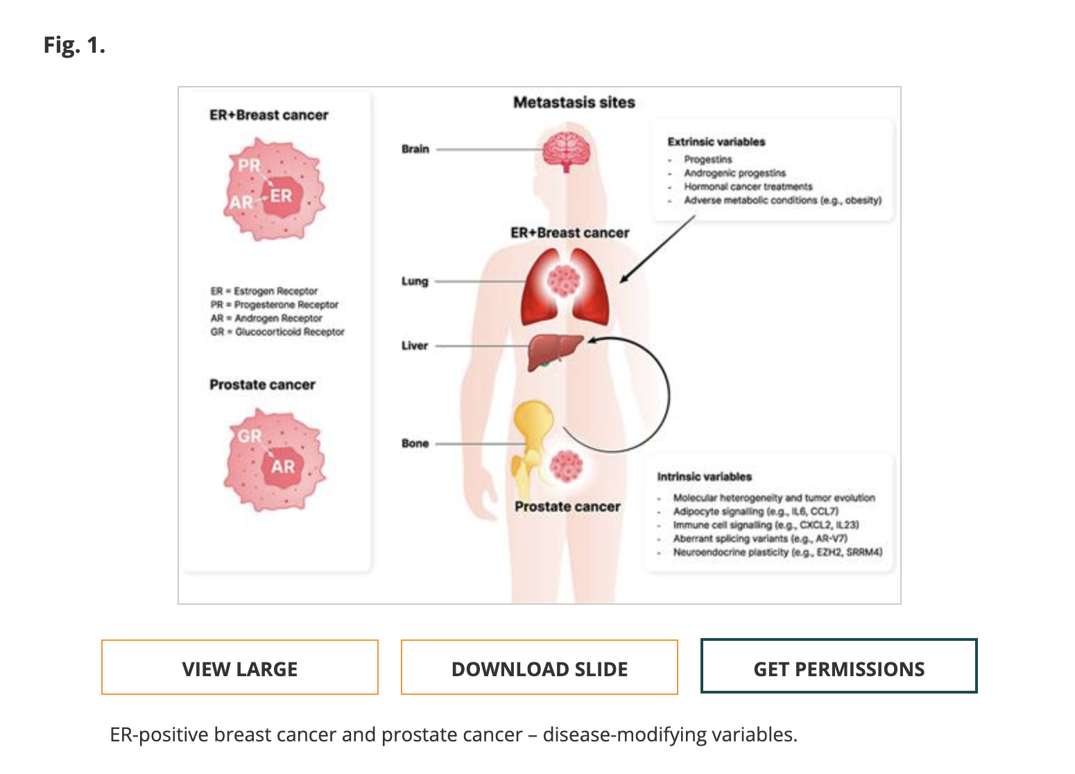
One final behavioral pattern was consistent across all sessions: without any prompting, every participant instinctively moved toward the image itself first, clicking directly on it to try to request permission. The button wasn't where they expected it, but their behavior made clear exactly where it should be.
Validating at Scale: What the GA4 Data Confirmed
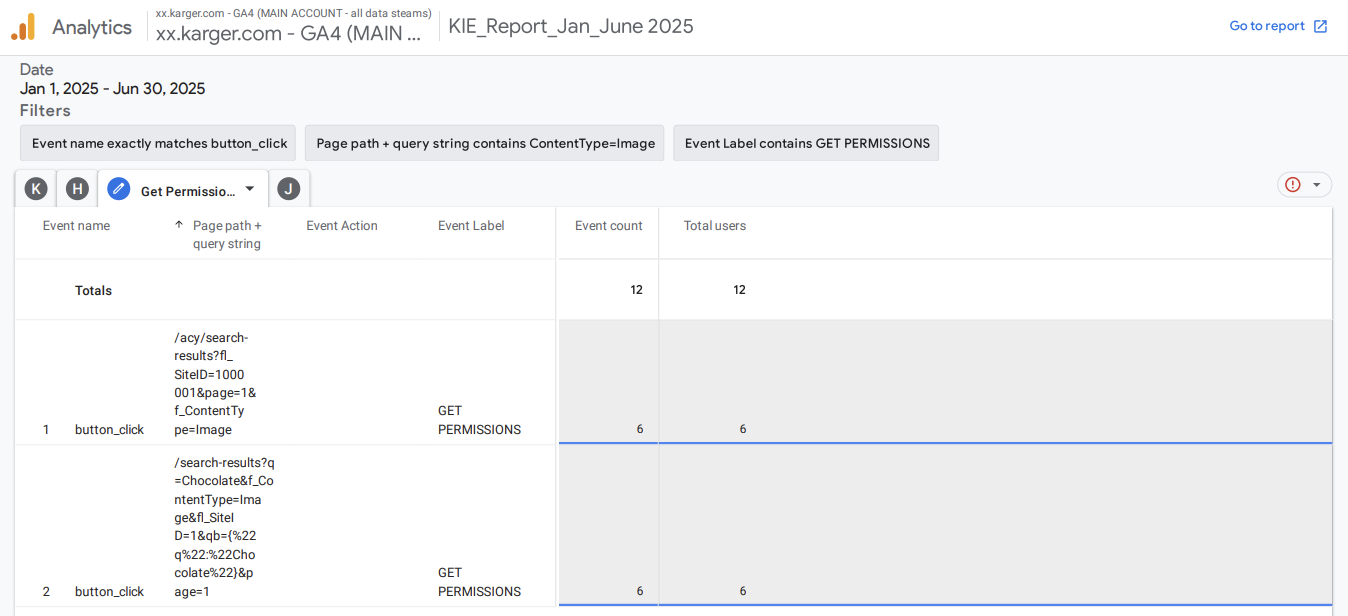
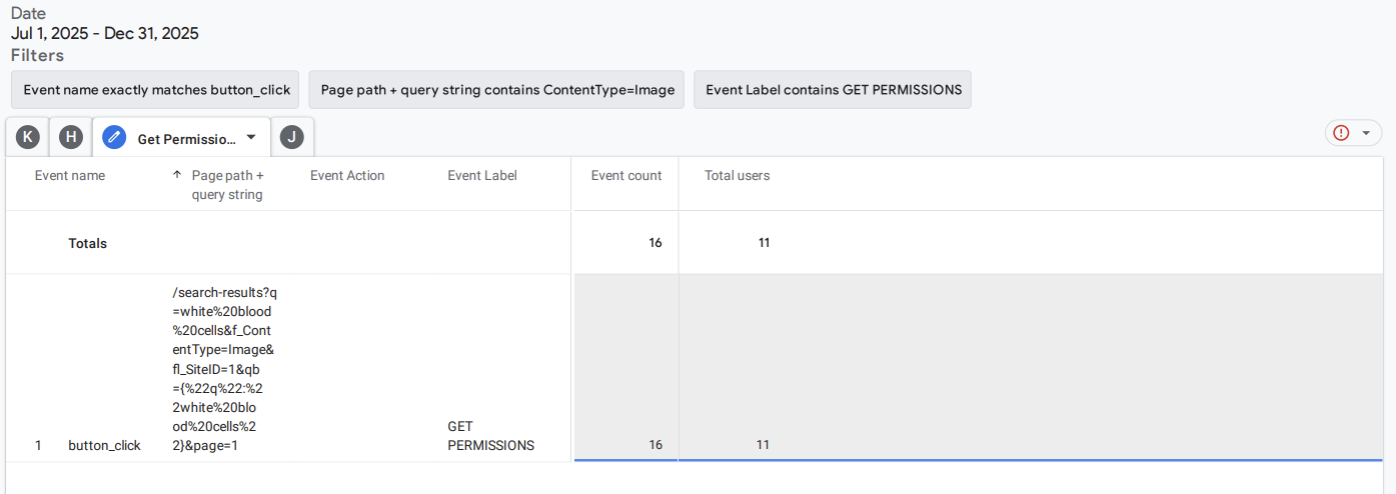
Rather than taking the qualitative findings at face value, I tracked behavior in GA4 across two six-month periods to test whether the discoverability issue was real at scale, or specific to our small sample.
The numbers confirmed what we had seen in testing:
The vast majority of people landing on the page never engaged with the core search feature at all. The data didn't contradict the usability findings. It confirmed them at scale.
The Recommendation: Test Before You Build
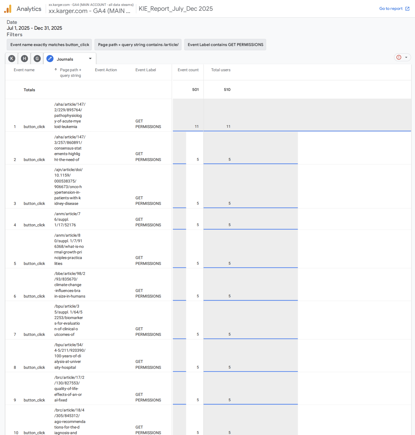
Rather than recommending a full redesign based on qualitative data alone, I proposed a comparative approach: ask the developer to add a new button directly on the image, while keeping the original placement intact. This would allow us to track both in parallel through GA4 and let the data tell us which placement users actually responded to.
The results were unambiguous:
Users behaved exactly the way they had in testing. They went to the image. The quantitative data confirmed what the qualitative sessions had shown: placement at the moment of intent is what drives action.
Reflection
This project taught me two things I carry into every research engagement since.
The first is that the most important question in early-stage research is often not "does this work?" but "are we testing with the right people?" Catching the user segment problem in round one, rather than after months of iteration, saved the team from building solutions for an audience that didn't have the problem.
The usability sessions gave us the hypothesis. The GA4 data gave us the proof. And the comparative button test gave us a way to make the right call without guessing.